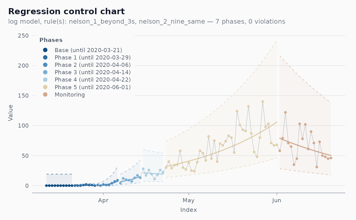
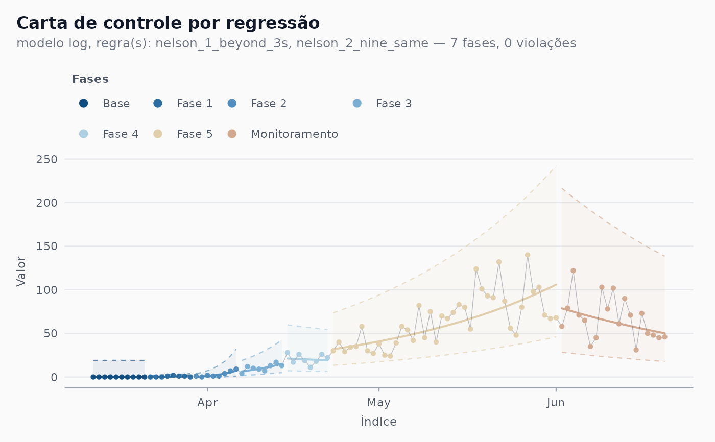
The autoplot() method for shewhart_regression() charts: per
phase, a shaded band between dashed limits and a solid centre line;
observations coloured by phase; out-of-control points ringed.
Usage
autoplot.shewhart_regression(
  object,
  show_violations = TRUE,
  show_sigma_zones = FALSE,
  locale = NULL,
  phase_dates = NULL,
  legend_position = c("top", "inside"),
  ...
)
Arguments
- object
A
shewhart_regressionchart.- show_violations
Logical. Ring out-of-control points?
- show_sigma_zones
Ignored; kept for a uniform signature.
- locale
Optional override for the chart's stored locale.
- phase_dates
Show where each phase ends in the legend, e.g. "Phase 1 (until 2020-05-18)"?
NULL(default) does so when the index column is aDateor date-time;TRUEforces it for any index (the last index value of each phase);FALSEturns it off. The last phase ("Monitoring") never carries an end.- legend_position
"top"(default) puts the legend above the panel, wrapping to several rows when there are many phases;"inside"stacks it in a single column in the top-left corner of the panel, on the panel colour, like the figures of Ferraz et al. (2020).- ...
Unused.
Examples
# \donttest{
pe <- subset(cvd_brazil, region == "PE" & date <= as.Date("2020-06-20"))
fit <- shewhart_regression(pe, value = new_deaths, index = date,
model = "log", limits_scale = "model",
phase_rule = "we_seven_same")
ggplot2::autoplot(fit, legend_position = "inside")
 ggplot2::autoplot(fit, phase_dates = FALSE, locale = "pt")
 # }
# }