Classical Shewhart charts assume the process mean is stationary — constant in time, apart from chance variation. Many real processes violate this assumption: a curing oven drifts, a microbial culture grows, an epidemic curve rises and falls, sensor calibration shifts. Applying a classical chart to a trended process produces systematically wrong limits and a flood of false alarms (or, equivalently, false reassurances).
The right approach is the one Mandel (1969) proposed in the
Journal of Quality Technology’s very first issue: fit a model
for the trend and place control limits around the fitted curve,
not around a constant centre line. This is what
shewhart_regression() does.
A simple example: linear drift
temperature_drift is 200 minutes of sensor readings on a
curing oven. The truth is a slow linear drift superimposed on a periodic
component plus noise.
fit <- shewhart_regression(
  temperature_drift,
  value = temp_c,
  index = minute,
  model = "linear"
)
broom::glance(fit)
#> # A tibble: 1 × 8
#>   type        n phase sigma_hat sigma_method n_violations n_rules pct_violations
#>   <chr>   <int> <chr>     <dbl> <chr>               <int>   <int>          <dbl>
#> 1 regres…   200 phas…     0.366 mr                     11       2          0.055
autoplot(fit)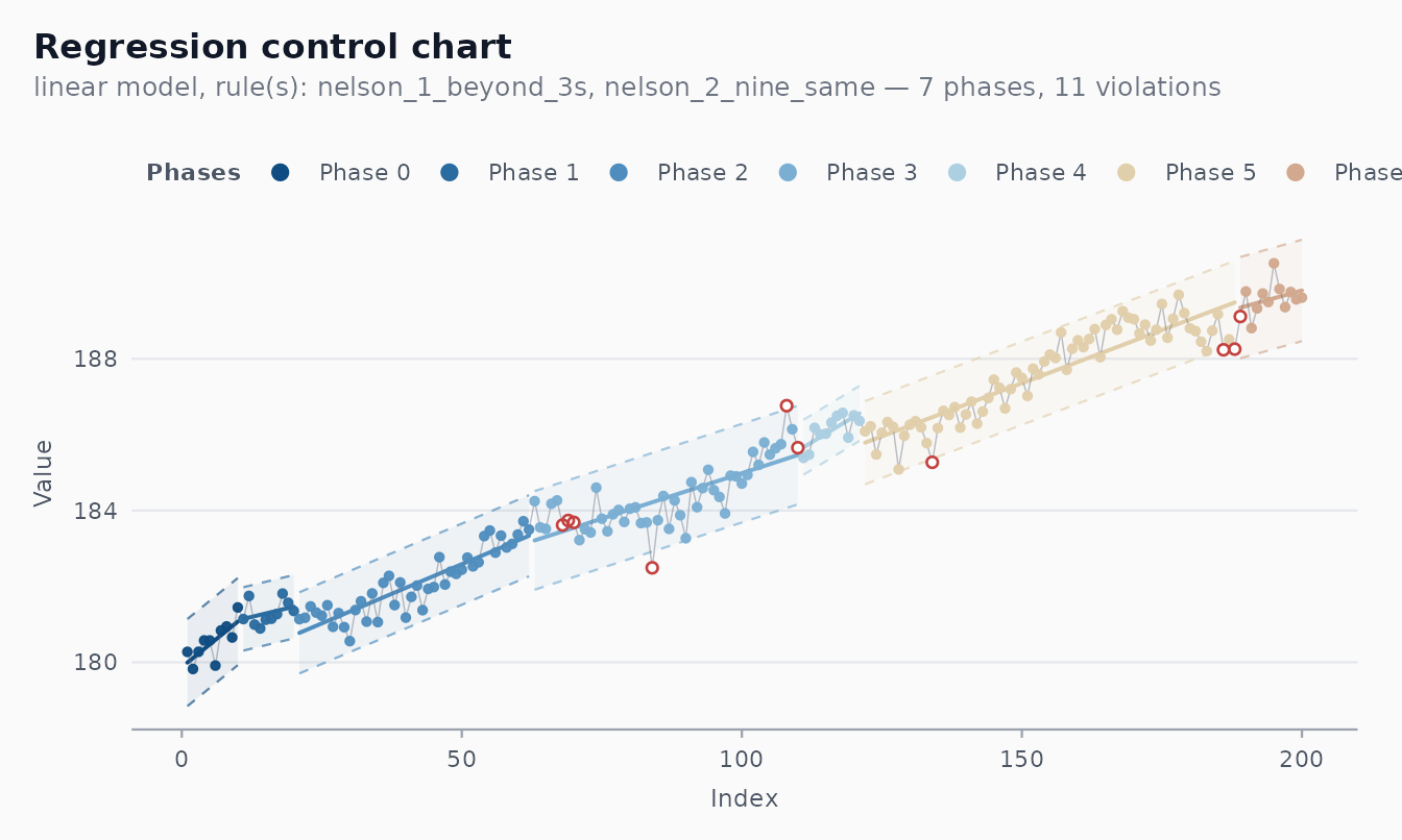
The chart’s centre line follows the fitted line, and limits are where is estimated from the moving range of the residuals.
Sigma from residuals
A subtlety: the residuals from a regression fit are
correlated under ordinary least squares, even when the model is
correctly specified (adjacent residuals share the influence of the same
fitted slope). The classical
estimator partially absorbs this, but for short series or autocorrelated
noise we recommend checking the residuals first via
shewhart_diagnostics():
shewhart_diagnostics(fit) # residuals~fitted, Q-Q, ACF, MR, histogramIf the ACF panel shows non-trivial autocorrelation, consider modelling it explicitly (a wider topic; see Box, Jenkins & Reinsel 2008) before relying on the chart.
Phase detection
shewhart_regression() can split the series into phases
automatically: when a runs rule fires (default Nelson 2 — nine
consecutive points on the same side of the fitted curve), a new phase
begins and the model is re-fit. This generalises the original v0.1.x
behaviour with a cleaner, configurable rule:
set.seed(1)
trended <- tibble::tibble(
  t = 1:120,
  y = c( 1:60 * 0.5  + rnorm(60, sd = 0.5),     # phase 1
         30 + 1:60 * 0.1 + rnorm(60, sd = 0.5)) # phase 2: shift + slowdown
)

fit <- shewhart_regression(trended, value = y, index = t,
                           model = "linear",
                           phase_rule = "nelson_2_nine_same")
broom::glance(fit)
#> # A tibble: 1 × 8
#>   type        n phase sigma_hat sigma_method n_violations n_rules pct_violations
#>   <chr>   <int> <chr>     <dbl> <chr>               <int>   <int>          <dbl>
#> 1 regres…   120 phas…     0.481 mr                      7       2         0.0583
length(fit$fits)    # number of phases detected
#> [1] 7
The phase_rule argument accepts any rule from
shewhart_rules_available(). The legacy 7-points rule from
v0.1.x is still available as
"we_seven_same":
fit_legacy <- shewhart_regression(trended, value = y, index = t,
                                  model = "linear",
                                  phase_rule = "we_seven_same")
length(fit_legacy$fits)
#> [1] 9
The trade-off is straightforward. With Nelson 2 (9 same side), the
in-control ARL is about 256 — false phase changes are rare. With the WE
7-same rule, ARL_0 is about 64 — phase changes are detected faster but
at a higher false-alarm cost. See the arl-simulation
vignette for a quantitative comparison.
autoplot(fit) # Nelson 2 — usually 1–2 phases
autoplot(fit_legacy) # WE 7 — typically more phases on the same data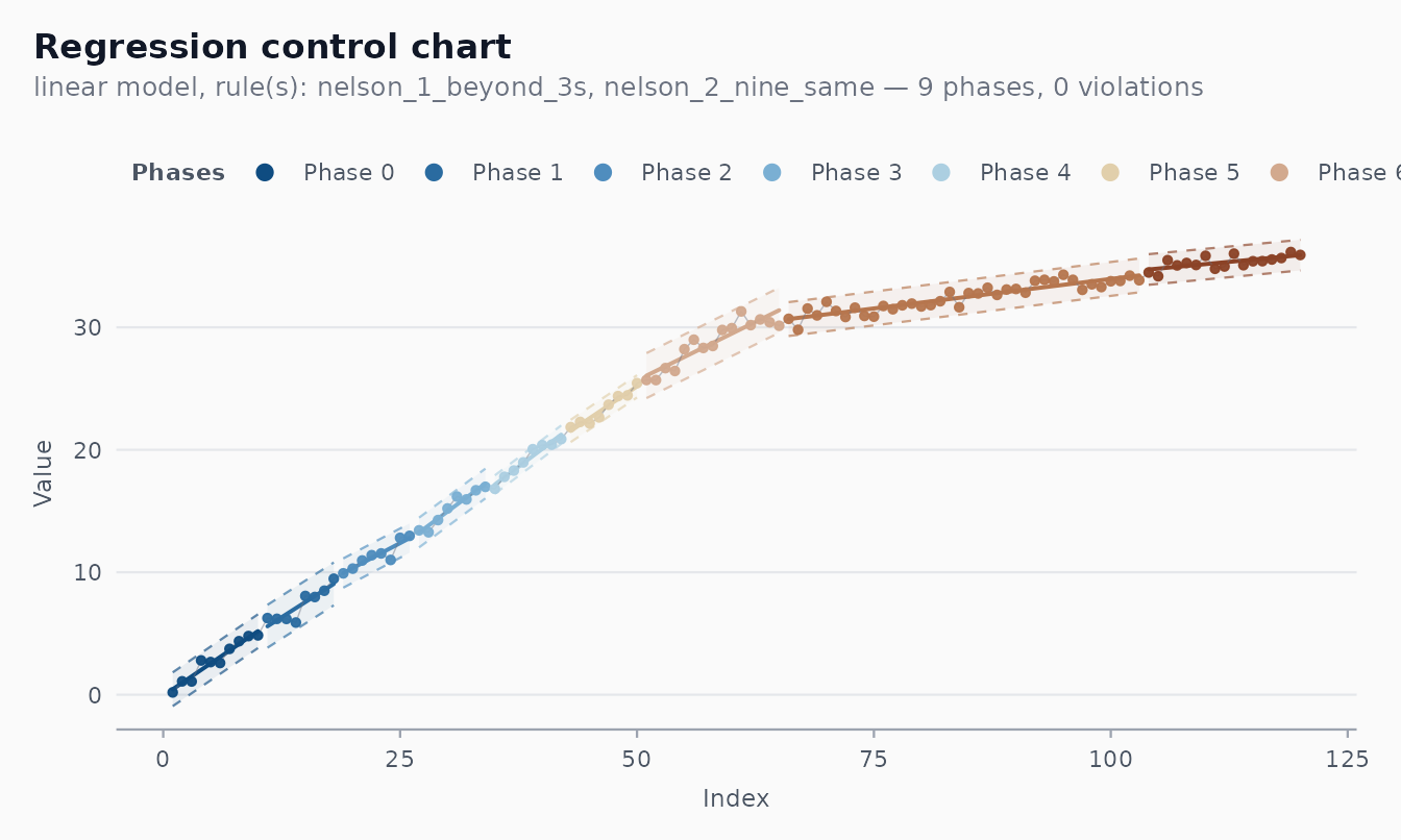
A worked example with many phases and visible violations
The COVID-19 mortality series for Recife is a textbook trended
process: a long, irregular climb, a peak, a slow decline. With a single
regression line and the legacy we_seven_same rule (the one
the original SBPO 2020 paper used), the chart partitions the series into
phases, fits a local trend in each, and flags the days when the observed
value departs sharply from the local trend.
fit_recife <- shewhart_regression(
  cvd_recife,
  value      = new_deaths,
  index      = .t,
  model      = "loglog",
  phase_rule = "we_seven_same",
  rules      = c("nelson_1_beyond_3s", "we_seven_same"),
  lower_bound = 0          # death counts can't go negative
)

length(fit_recife$fits)              # phases detected
#> [1] 9
nrow(fit_recife$violations)          # individual flagged observations
#> [1] 10
autoplot(fit_recife)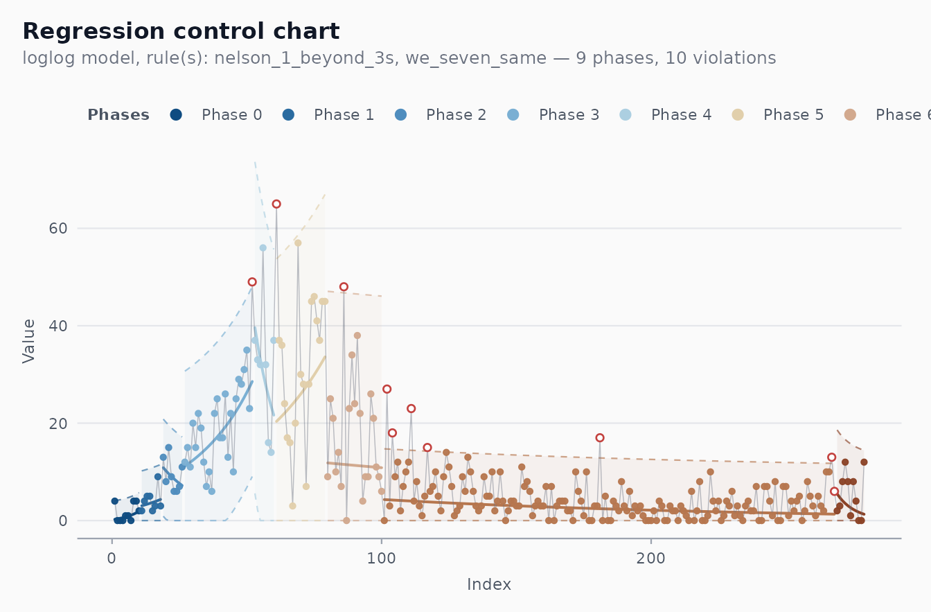
Each shaded band is a phase. The dashed lines are that phase’s 3-sigma limits, the solid line is the regression centre line for that phase. Points highlighted in firebrick are the days flagged by the rule set as departing from the local trend — these are the days that motivated investigation in the original analysis.
The violations table tells you exactly which days fired
which rule:
head(fit_recife$violations, 8)
#> # A tibble: 8 × 5
#>   position rule               description            value severity
#>      <int> <chr>              <chr>                  <int> <chr>
#> 1       52 nelson_1_beyond_3s 1 point beyond 3 sigma    49 out_of_control
#> 2       61 nelson_1_beyond_3s 1 point beyond 3 sigma    65 out_of_control
#> 3       86 nelson_1_beyond_3s 1 point beyond 3 sigma    48 out_of_control
#> 4      102 nelson_1_beyond_3s 1 point beyond 3 sigma    27 out_of_control
#> 5      104 nelson_1_beyond_3s 1 point beyond 3 sigma    18 out_of_control
#> 6      111 nelson_1_beyond_3s 1 point beyond 3 sigma    23 out_of_control
#> 7      117 nelson_1_beyond_3s 1 point beyond 3 sigma    15 out_of_control
#> 8      181 nelson_1_beyond_3s 1 point beyond 3 sigma    17 out_of_control
The model menu
model = ... |
Functional form |
|---|---|
"linear" |
|
"log" |
|
"loglog" |
|
"gompertz" |
Gompertz cumulative growth (via nls) |
"logistic" |
Logistic cumulative growth (via nls) |
"auto" |
Box-Cox guidance to choose between linear/log/log-log |
The "auto" setting calls shewhart_box_cox()
internally and selects based on the maximum-likelihood lambda. It is a
good first try when you don’t have strong prior knowledge of the
functional form.
For full control, supply your own formula:
shewhart_regression(temperature_drift, value = temp_c, index = minute,
                    formula = temp_c ~ poly(minute, 3))
A growth-curve example
bacterial_growth is a 24-hour OD time series whose true
mean is a Gompertz curve.
fit_gomp <- shewhart_regression(
  bacterial_growth,
  value = od,
  index = hour,
  model = "gompertz"
)
broom::glance(fit_gomp)
#> # A tibble: 1 × 8
#>   type        n phase sigma_hat sigma_method n_violations n_rules pct_violations
#>   <chr>   <int> <chr>     <dbl> <chr>               <int>   <int>          <dbl>
#> 1 regres…    80 phas…     0.160 mr                      8       2            0.1
autoplot(fit_gomp)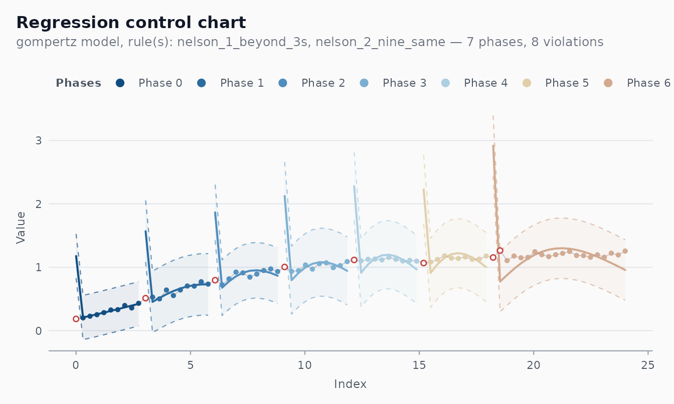
The Gompertz parameterisation we use comes from Zwietering et al.
(1990) and is in ?Gompertz.
Interpreting violations
In a regression chart, a violation means an observation departs from the trend, not from a constant baseline. This is exactly what we want for trended processes: the question becomes “is the deviation from the expected trajectory unusual?”, not “is the value high or low compared to a fixed reference?”.
Phase changes are themselves interpreted as suspected shifts in the
underlying process — a re-tuned controller, a new operator, a new batch
of raw material. shewhart_regression() highlights them in
autoplot() by colouring each phase distinctly.
References
- Mandel, B. J. (1969). The Regression Control Chart. Journal of Quality Technology, 1(1), 1-9.
- Perla, R. J., Provost, S. M., Parry, G. J., Little, K., &
Provost, L. (2020). Understanding variation in reported COVID-19 deaths
with a novel Shewhart chart application. International Journal for
Quality in Health Care, 32(S1), 49-55. — the three-phase hybrid C/I
chart that motivated the multi-phase regression-chart design used by
shewhart_regression(). - Ferraz, C., Petenate, A. J., Wanderley, A. L., Ospina, R., Torres,
J., & Moreira, A. P. (2020). COVID-19: Monitoramento por gráficos de
Shewhart. Revista Brasileira de Estatística. — the Brazilian
adaptation; source of the legacy
we_seven_samephase rule and the original analysis settings reused in the Recife example above. - Hawkins, D. M. (1991). Multivariate Quality Control Based on Regression-Adjusted Variables. Technometrics, 33(1), 61-75.
- Wheeler, D. J., & Chambers, D. S. (1992). Understanding Statistical Process Control (2nd ed.). SPC Press.
- Box, G. E. P., Jenkins, G. M., & Reinsel, G. C. (2008). Time Series Analysis: Forecasting and Control (4th ed.). Wiley.
- Zwietering, M. H. et al. (1990). Modeling of the Bacterial Growth Curve. Applied and Environmental Microbiology, 56(6), 1875-1881.
- Box, G. E. P., & Cox, D. R. (1964). An Analysis of Transformations. Journal of the Royal Statistical Society B, 26(2), 211-252.