When univariate charts are not enough
Suppose you are running a chemical reactor with three process variables — temperature, pressure, flow — that are mechanically coupled. In normal operation they move together: when temperature rises, pressure rises with it. A failure that breaks the coupling (say, a stuck pressure sensor that reads near the mean while temperature drifts) leaves the marginal distribution of each variable inside its 3-sigma limits, but the joint distribution is clearly not what it was. Three Shewhart I charts would tell you nothing has happened.
This is the textbook case for a multivariate chart: when the informative signal lives in the correlation structure, not in any one marginal.
# Correlated baseline — temperature and pressure track together
set.seed(2026)
n     <- 80
Sigma <- matrix(c(1, 0.92, 0.92, 1), 2, 2)
Z     <- MASS::mvrnorm(n, mu = c(0, 0), Sigma = Sigma)

# A "stuck pressure" fault: temperature still varies, pressure stays put
faulty <- cbind(temp = rnorm(20, 0, 1), pressure = rnorm(20, 0, 0.05))

reactor <- tibble::tibble(
  hour     = 1:100,
  temp     = c(Z[, 1], faulty[, 1]),
  pressure = c(Z[, 2], faulty[, 2])
)
A glance at each variable independently shows nothing dramatic:
shewhart_i_mr(reactor, value = temp,     index = hour) |> autoplot()
#> Warning: Removed 1 row containing missing values or values outside the scale range
#> (`geom_line()`).
#> Warning: Removed 1 row containing missing values or values outside the scale range
#> (`geom_point()`).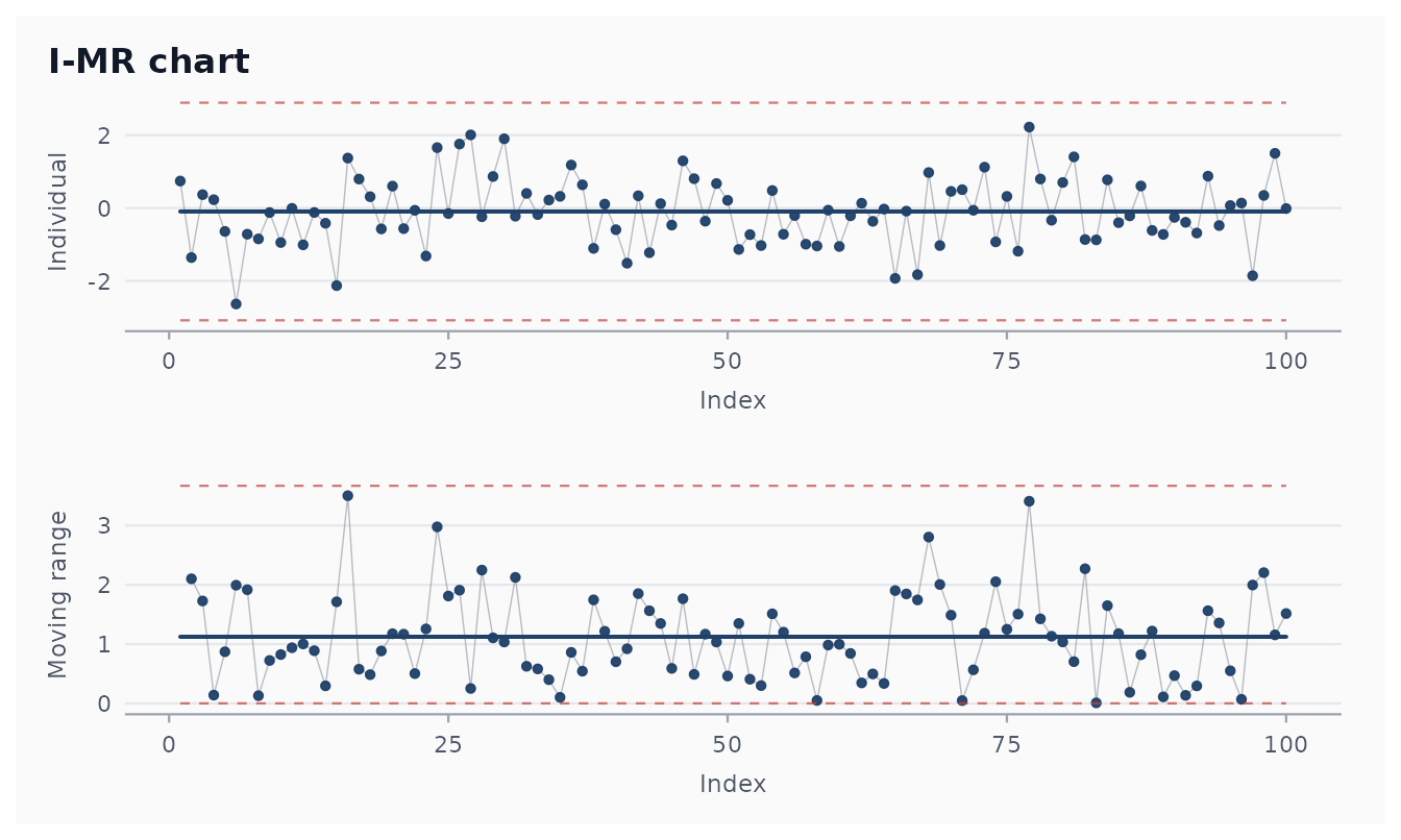
shewhart_i_mr(reactor, value = pressure, index = hour) |> autoplot()
#> Warning: Removed 1 row containing missing values or values outside the scale range
#> (`geom_line()`).
#> Removed 1 row containing missing values or values outside the scale range
#> (`geom_point()`).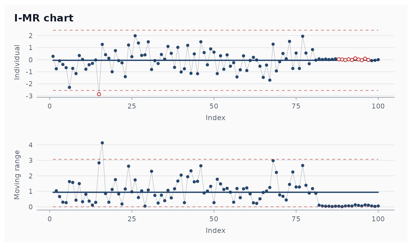
But the Hotelling chart catches the fault:
fit <- shewhart_hotelling(reactor, vars = c(temp, pressure),
                          index = hour)
fit
#>
#> ── Shewhart chart hotelling ────────────────────────────────────────────────────
#> • Observations / subgroups: 100
#> • Phase: "phase_1"
#> • Sigma estimate ("hotelling"): NA
#>
#>
#> ── Control limits ──
#> # A tibble: 1 × 3
#>   chart line  value
#>   <chr> <chr> <dbl>
#> 1 T2    UCL    11.3
#> ── Rule violations ──
#>
#> ! 2 violations across 1 rule.
#> hotelling_ucl: 2 hits.
autoplot(fit)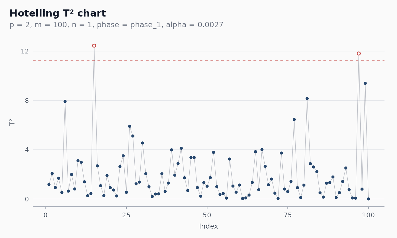
What the chart computes
The Hotelling T² statistic is the squared Mahalanobis
distance of each observation from the joint mean, scaled by the inverse
covariance:
It collapses the p-variate problem to a single scalar,
with a UCL chosen so that under the null (process in control,
multivariate normal) the false-alarm rate per observation is
alpha. The default alpha = 0.0027 matches the
conventional Shewhart 3-sigma rate.
Two flavours, picked automatically by the constructor:
-
Individual observations
(
subgroup = NULL, the default). Each row is one observation. Sigma is estimated from the row vectors. -
Subgrouped observations
(
subgroup = column). Rows sharing a value ofsubgroupform one subgroup, andT²is computed on the subgroup means with the pooled within-subgroup covariance.
For each flavour, the Phase I limit (retrospective evaluation of the
in-control assumption) and Phase II limit (prospective monitoring of new
data against the calibration) come from different exact distributions;
pass phase = "phase_2" for the wider Phase II UCL.
Diagnosing an alarm with contributions
shewhart_hotelling() augments the output with a
contribution column per variable: the marginal increase in
T² attributable to that variable. When the chart fires, the
contribution columns point at the responsible variable(s).
fit$augmented |>
  filter(.flag_signal) |>
  select(hour, .t2, .upper, starts_with(".contrib_")) |>
  head(5)
#> # A tibble: 2 × 5
#>    hour   .t2 .upper .contrib_temp .contrib_pressure
#>   <int> <dbl>  <dbl>         <dbl>             <dbl>
#> 1    15  12.4   11.3          1.22              7.74
#> 2    97  11.8   11.3         11.8               8.27
In our reactor example, observations after hour 80 typically have the
bulk of their T² value coming from
.contrib_pressure — the chart is correctly fingerprinting
the stuck pressure sensor as the culprit.
Phase II workflow
The same calibrate() / monitor() workflow
used for univariate charts works for the multivariate chart too:
set.seed(7)
in_control <- as.data.frame(MASS::mvrnorm(120, c(0, 0), Sigma))
names(in_control) <- c("temp", "pressure")
calib <- calibrate(in_control, vars = c(temp, pressure),
                   chart = "hotelling")

# Fresh data — pressure-sensor fault for the last 10 readings
new_data <- as.data.frame(MASS::mvrnorm(40, c(0, 0), Sigma))
names(new_data) <- c("temp", "pressure")
new_data$pressure[31:40] <- rnorm(10, 0, 0.05)

mon <- monitor(new_data, calib)
sum(mon$augmented$.flag_signal)
#> [1] 3
autoplot(mon)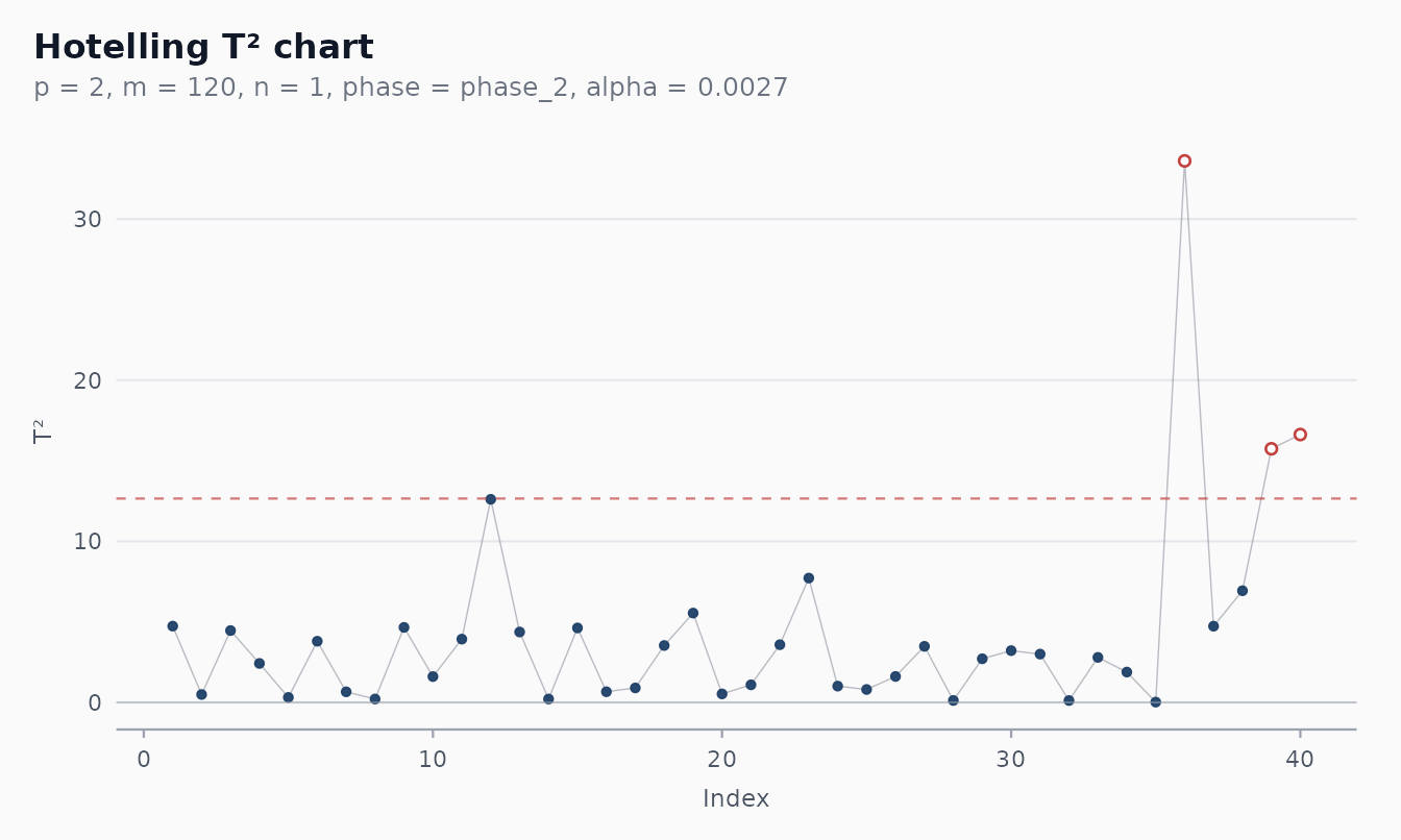
monitor() reuses the Phase I mean vector and inverse
covariance (stored on the calibration object) and applies the
appropriate Phase II UCL — strict separation of estimation and
monitoring, matching the rest of the package’s Phase I / Phase II
story.
When not to reach for a Hotelling chart
A multivariate chart is not a free upgrade over univariate charts. Three reasons it is sometimes the wrong tool:
- Diagnosis is harder. Univariate charts immediately tell you which variable drifted; the Hotelling chart needs the contribution decomposition to point at a culprit. For shifts that only affect one variable, the matched univariate chart usually has lower ARL_1.
-
Sample-size hunger. Estimating a
p × pcovariance well needs roughly5 pto10 pobservations per chart parameter. For p = 5 variables that is ~50 observations just to characterise the in-control state. With sparse data, a multivariate chart is a noise generator. -
Model assumptions. The exact UCL is calibrated
under joint normality. Multivariate non-normality, especially heavy
tails, inflates the false-alarm rate. Check
shewhart_diagnostics()per variable before committing.
A common production pattern: run univariate Shewhart or EWMA charts on every variable for direct diagnosis, and a Hotelling chart on top to catch the correlation-breaking faults the univariate charts will miss.
References
- Hotelling, H. (1947). Multivariate quality control. In: Techniques of Statistical Analysis. McGraw-Hill.
- Tracy, N. D., Young, J. C., & Mason, R. L. (1992). Multivariate control charts for individual observations. Journal of Quality Technology, 24(2), 88-95.
- Mason, R. L., Tracy, N. D., & Young, J. C. (1995). Decomposition
of
T²for multivariate control chart interpretation. Journal of Quality Technology, 27(2), 99-108. - Mason, R. L., & Young, J. C. (2002). Multivariate Statistical Process Control with Industrial Applications. SIAM/ASA.
- Montgomery, D. C. (2019). Introduction to Statistical Quality Control (8th ed.). Wiley. Chapter 11.